
interaction design research
COGNITIVE SCIENCE SEMINAR

In this studio class we dove deep into interaction design and honed our design skills, and were introduced to topics such as social computing, input & interaction techniques, and information design. After each assignment, we presented our work to the rest of the class for feedback.
COMPARE, CONTRAST, & CROSS-POLLINATE
In this assignment, I had to compare and contrast the interface design choices for two sites for finding people. This included looking at how language choice, visual design, and interaction flow conveyed a different feel across the two sites and how this indicated what type of behavior is expected. It was also important to look at how these sites differed in signals for interaction, how they utilized user input to improve user experience, as well as the kinds of social connections they leveraged.
I decided to compare two job-seeking sites: Indeed and Looksharp.


MY "MINORITY REPORT"
For this assignment I was tasked with making a video prototype of a compelling gestural interaction for a single task, like how Tom Cruise and Steven Spielberg brought Philip K. Dick's novel Minority Report to the silver screen with an interactive future.
I was inspired to design a new gesture interaction with a thermostat after struggling to use the one in my apartment. I came up with the idea of creating an electronic interface; however, after googling electronic thermostats I discovered that a variety of them already existed. Because of this I decided to include a more visual temperature scale instead of the standard up and down arrows used to change the temperature. This made things a little more challenging because now I had to come up with a unique gesture for this type of interface, while still avoiding the “Midas Touch problem”.
I think users would like how the interface I designed has a more visual representation of the temperature being set -- instead of repeatedly clicking an arrow button to set the temperature higher or lower, users can use their fingers to set their desired temperature on the scale. To avoid the “Midas Touch problem,” my gesture has users press and hold a button to change the temperature or fan setting, and then use their index finger to slide a marker indicating the desired temperature or fan setting to use. On the other hand, I think the biggest drawback could be that users might find the temperature scale I designed unnecessary work, because they may not be changing their desired temperature drastically enough to warrant using a scale as opposed to clicking an up or down arrow button.
One idea I rejected when coming up with my design was using one’s fingers to trace the route of a map on a cell phone. For instance, after looking up directions users would be able to follow their route in more of a first-person perspective (instead of having to click through the steps one-by-one or zooming the map in and out), by dragging their fingers along the route. However, I decided to change my idea because this seemed a bit too similar to what Google already uses with their Street View feature.
One thing I learned about prototyping after doing this homework was how to think about showing a user’s interaction with the interface using paper prototypes. Whereas with a digital prototype I would be able to have users use a real slider, with my paper prototype I had to come up with a way to represent how to use my temperature scale, as well as the messages from the system itself.
ANALYZING SEARCH USER INTERFACES
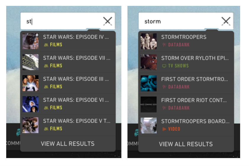
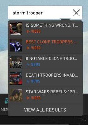
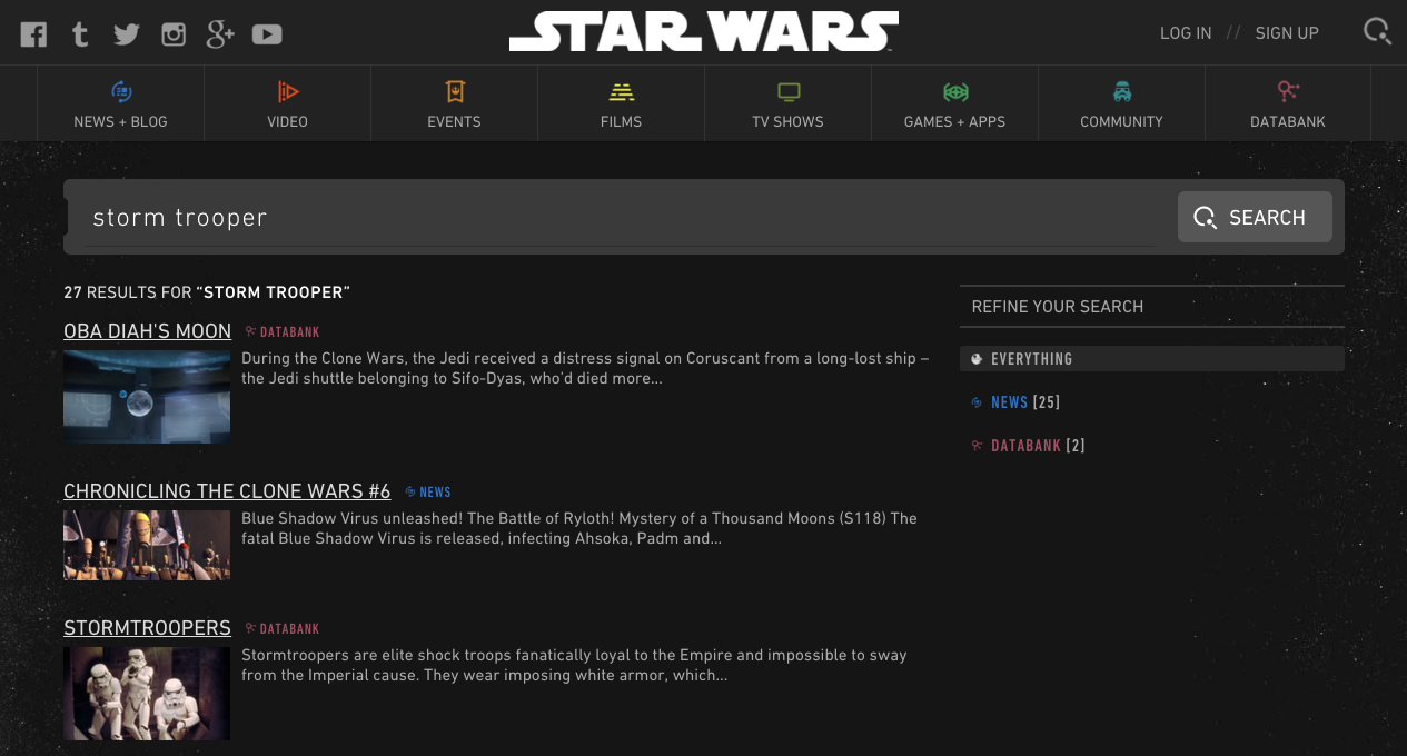
In first part of this assignment, I had to find an example of a successful search I completed and identify the search interface used to complete it. I then had to analyze how it was successful and how that success was a result of the interface choice. I decided to discuss the unique search bar found on the Star Wars website.
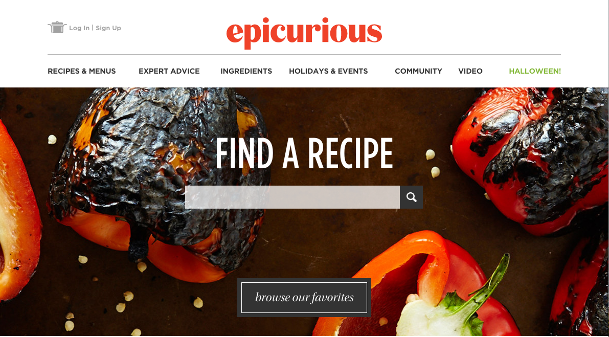
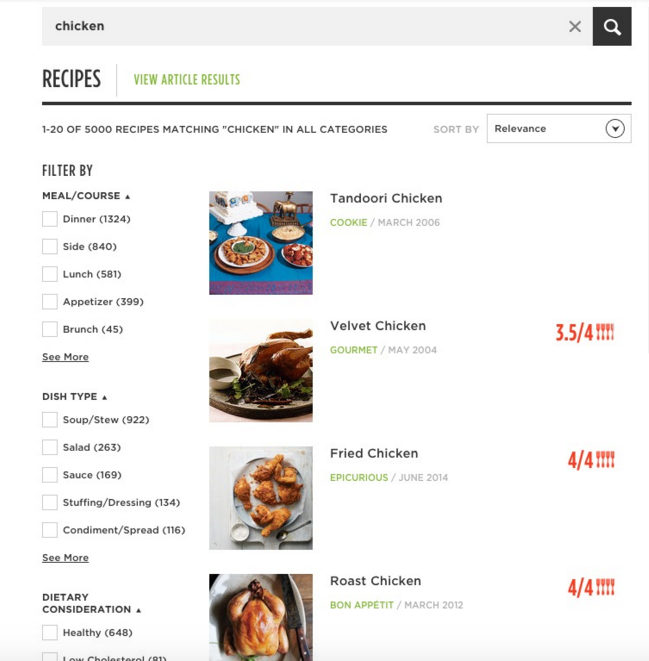
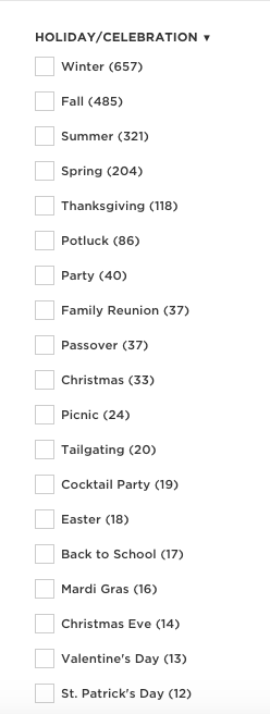
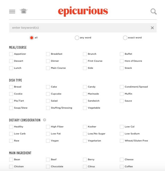
In the second part of this assignment, I found an example of a difficult-to-use search interface and explained the search attempted and how the interface inhibited its success. I analyzed the extensive search options found on the recipe site Epicurious.
DASHBOARDS & ALERTS
The goal of this assignment was to redesign a dashboard and an alert system. I chose to redesign the popular online project hosting site Github. I wanted to make use of the real estate of the screen by extending the nav bar and moving it to the left hand side of the screen, and by implementing a new scrolling notification center on the right. The purpose of the notification center is to display the recent commits to a project right away to the user, in order to keep them informed about project activity. I thought this, in tandem with sidebar alerts when a new commit occurs, would help prevent merge conflicts within a team project. I also included buttons at the top of the page to allow users to switch between their recent repositories.
COMPUTING BY THE INCH, FOOT, & YARD
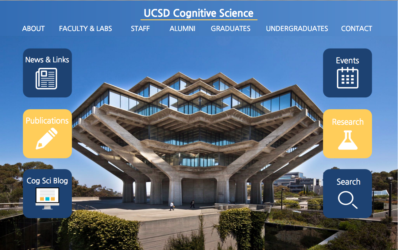
Throughout the quarter I worked on redesigning the site of my choice, the UCSD Department of Cognitive Science, for various form factors - a smartwatch, a phone, a tablet, a desktop, and a large-scale screen. For these various wireframes I had to think about the restraints in the types of interactions each form factor afforded.


DESIGN BLOG
For our final assignment, we had to focus on a particular topic in design and write a critique in the form of a blog post. I decided to discuss the potential implications of virtual reality by comparing and contrasting Google Cardboard and Oculus Rift.
The link to my blog post can be found here.